In honor of some of the most hideous NBA jerseys of all time that were busted out this week: New Orleans Hornets Mardi Gras two tone jersey, Memphis Grizzles throwback’s and the all black Miami Heat jerseys. I thought I would bring you the worst jerseys of an era full of bad jersey the 1990’s.
As you will see some people in front offices all across the NBA thought that cartoon looking logo’s and different shades or purple and teal were really cool, although cross-colors and Starter jackets were cool in the 90’s too, say maybe it was something in the water. Without further ado the 10 worst jerseys of the 90’s:
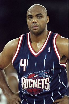
10.) The Houston Rockets:
A lot of teams change their jersey to try and change the public image of a team. Maybe even to help wash off a stigma of losing, see Broncos. Denver. 1998. When the Rockets changed their jerseys they were just a year or two removed from back to back titles and they went way in the wrong direction with this disaster. A cartoon rocket, blue backdrop with fading white pin stripes. Gross! The fact that the logo sits right on top of Chucks belly does not help.
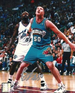
9.) The Vancouver Grizzlies:
We’re going to start to see a theme here. Lots of teal coming up. The worst part about this train wreck is that it looks like the jerseys of a brand new High School in some cookie cutter suburb. Nothing about it says you’re in the big leagues now. It pretty much screams we suck. When you make Bryant “Big Country” Reeves your franchises first overall pick, you do kind of suck.
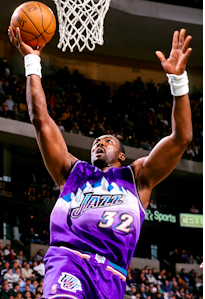
8.) The Utah Jazz:
Another color they really liked to use in the 90’s: purple. Purple and teal, with huge logos. I’m actually a little shocked the people of Utah didn’t throw some teal in these uni’s. This is another example of team changing their style for no real reason. Why be classic? Where is the fun in that? You know what our uniform needs? Mountains. Big white mountains. It’ll be awesome. Guess what? Not awesome, and while we here Karl Malone also, not awesome.
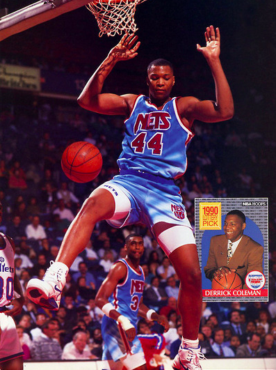
7.) The New Jersey Nets:
(Source: http://netsarescorching.com/)
I think these jerseys were hyper-color. That’s right hyper-color. If I were Derrick Coleman I would have mailed it in too. One more time. HYPER- COLOR!
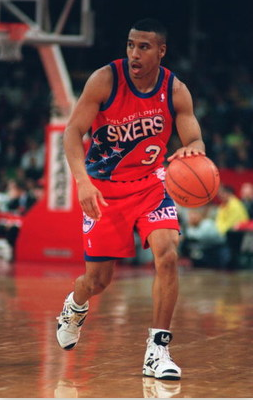
6.) The Philadelphia 76ers:
(Source: http://thesixersense.com/)
76ers have a long and rich tradition of changing their uniforms. So much so that I had a hard time even finding a picture of these bad boys. Its like the people of Philly are saying, we’ll let you keep eating cheese steaks just don’t talk about these again. I really enjoy the 90’s trend of having a large logo on the shorts and the Sixers take it to the next level here. The band of stars (I don’t have any idea what this fashion trend should be called, so we’re going with band) that starts on one side of the shorts and finish’s on the other side of the jersey. Classic. Just like Dana Barros.
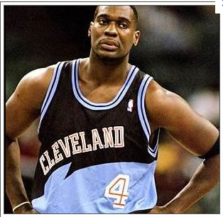
5.) The Cleveland Cavs:
(Source: http://fivetoolsports.blogspot.com/)
I don’t know what is going on here. But I do know that there is teal. It’s kind of a blue teal but its still teal. Why is the blue teal stripe kind of like a wave? I don’t know. Are there waves in Cleveland? I pretty sure not. You will never see this jersey worn as a throwback. Ever. Unless one of Shawn Kemp’s 30 kids (that number is approximate) is wearing one.
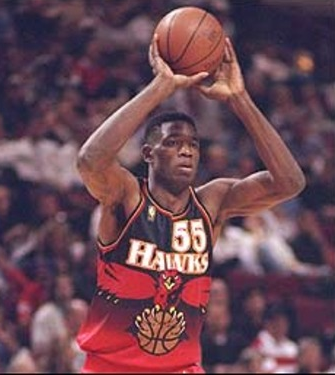
4.) The Atlanta Hawks:
(Source: http://www.bleacherreport.com/)
Big gaudy logo? Check. Ugly colors? Check. No real need to change the uniform? Check. Did they change the uniform again pretty quick after this change? Check. If these unis had purple or teal in them they would be the perfect ‘90’s uniform. It’s a shame Mutombo didn’t wag his finger at the team official who showed him this pile of garbage.
3.) The Milwaukee Bucks:
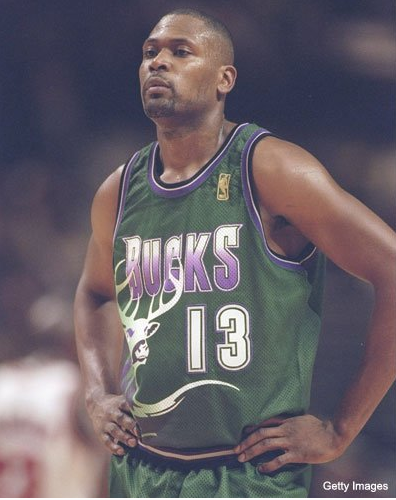
(Source: http://www.fanbase.com/)
This is so bad; it’s so bad that it probably should be on the top of this list. Except for the fact that I think it was an alternate and they may have only worn them 3 to 5 times at the most. I would venture to guess, and I have not done the research on this so don’t hold me to it, but I doubt you could even find a basketball card of any Bucks player wearing this jersey. It almost like an add for that game Buck Hunter. Fear the dear indeed.
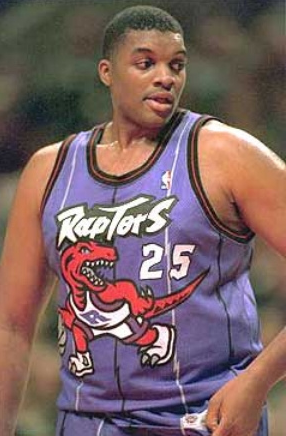
2.) The Toronto Raptors:
Boom! Purple! What a shit show this thing is. I know I was a kid in the 90’s and all so I thought cartoons were cool (still do) but why were professional basketball teams making their logos with cartoon art? Also does Steven Spielberg get a cut of all the money the Raptors make? He is the guy that made Raptors cool. With out Jurassic Park this team would totally have a different name. Like the Toronto Snow Storm or something. That would have been a cool cartoon logo. It looks like Oliver Miller ate a Raptor in this picture.
1.) The Detroit Pistons:

(Source: http://www.ballornuthin.com/)
This is the one. So, so bad. First off they had awesome uniforms before this debacle. So sweet in fact that they went back to the old uniform. These bad boys are teal; they have a cartoon horse on them. Just a murders row of bad ‘90s uniform clichés. The best part of these are the people who make these kind of decisions stuck with these god awful things out of spite for way too long, like if they some how held out long enough they might one day be cool. Maybe. Poor Grant Hill.
-This was special contributor Victor Marinier’s first article with us. Victor is a Cubs fan which means that at some point in his life he was a Doug Glanville fan.
As always, if you see a random jersey on the street snap a pic and send it to us on Instagram or Twitter @BaconSports and use #randomjersey. If you want to see the most comprehensive guide to random jerseys ever then you can check it out here.



 Bacon Sports is a sports content & social media marketing agency that turns your audience into raving fans by creating fun and engaging videos, podcasts, and social media content.
