![]()
On the latest Hoopster Nation podcast I mentioned that for the first time in my 34 years on earth I finally saw the hawk in the Atlanta Hawks logo. Up until then I’d always seen only the Pac-Man. Queue the Mallrats sailboat clip.
You might be wondering how it is that someone who watches and writes about sports all day every day never noticed the hawk in the logo? I’ve got a few reasons.
First, it clearly look like Pac-Man. I always wondered why the Pac-Man wasn’t all normal like regular Pac-Man but you only wonder that for so long before accepting it for what it is, a deformed Pac-Man. They wouldn’t have put it on the side of Doc Rivers boys size medium shorts if it wasn’t meant to be there. Plus, defo Pac-Man is definitely eating something which is a sure sign that it’s a Pac-Man. Sure the food to mouth ratio makes me believe that whatever defo Pac-Man is eating isn’t gonna fill him up, but I assume there’s a lot more where that came from.
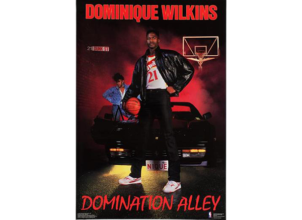
Next, I had this Dominique Wilkins poster hanging in my room growing up. Had the Hawks logo showed up somewhere on there then maybe in between listening to Shaq Diesel and Fu Schnickens I would have noticed the hawk. Unfortunately the Atlanta Hawks marketing department in the early 90’s was incompetent and never thought they should put the logo on the poster of the most electric player in franchise history. I’m flagging that.
And to further justify my case, a week or two ago (before I saw the hawk) I watched an ESPN commercial where they were promoting an upcoming Hawks game and what did they show chomping across the screen? You guessed it, defo Pac-Man. This makes zero sense what so ever if at any point you think there’s a hawk in there. This further supported my always looking from right to left case with the logo.
![]()
This just in, while doing a Google image searche for the Atlanta Hawks logo I just realized that there’s been multiple versions of defo Pac-Man. Since I always saw the same defo Pac-Man I never noticed the difference in the look of the hawk. Boy does the hawk on the right look much lamer. It’s like the US Postal Service designed it. However, I think the defo Pac-Man on the right looks much more fluid and like regular Pac-Man.
I’m actually kinda pissed that I now know the Hawks logo actually has a hawk in it. The hawk is no where near as cool as defo Pac-Man. I’m just going to pretend that like this didn’t happen and continue the rest of my life only seeing the defo Pac-Man. It’s just better that way.
Send all tips, suggestions, and praise to boom@baconsports.com.
Hey Yo, be cool like Tree Rollins and join our email list